Anyone come across these guys as yet?
No really comp as yet given another start up looking for funding it appears but believe commercial chip early 2023.
Below was from May and only posting cause of the neuromorphic side & comments on BRN popped up in the search.
How Rigpa is building chips inspired by our brains

www.preseednow.com

www.rigpa.ai
How Rigpa is building chips inspired by our brains
About six years ago, it was very trendy to talk about how A.I. could soon match or surpass human intelligence. The old sci-fi trope made popular in films like The Terminator seemed close to reality and everyone was reading
Nick Bostrom, as big names like Elon Musk talked up the almost limitless potential of A.I., and self-driving cars seemed just a few short years away from dominating our roads.
None of that has come to pass quite yet, but A.I. continues to make progress, finding its way into many aspects of our lives. Companies like Google, Microsoft, and Amazon harness it to make their own products smarter, and to empower third-party developers. It’s all useful stuff, but a time traveller from the wide-eyed days of 2016 might be a little disappointed.
That’s why it’s important to separate genuine advances from hype cycles. Away from the spotlight that shines on big tech company product launches, researchers and early-stage startups are working on technology that could form the next wave of A.I. and could bring us closer to artificial general intelligence (AGI), software that really does match human intelligence and adaptability.
Meet Rigpa
Rigpa is an Edinburgh-based startup that has been quietly working on A.I. technology inspired by how the human brain works; a field known as
neuromorphic computing. “The brain itself is so powerful but consumes very little power… 20 watts, like a lightbulb,” says Rigpa founder Mike Huang. “By mimicking the biology of the brain we believe we can create A.I. that has lower power consumption and faster inference speed.”
Rigpa’s work is based on Huang's PhD research into neuromorphic computing for radioisotope identification, and Huang believes that beyond improved efficiency, the approach could even help A.I. self-learn and generate its own innovative ideas.
“The A.I. will not be the equivalent to a human being, but you hope that the machine itself can let people be liberated from repetitive work, so they can spend more of their time working on creative things, or do what they really want to”.
This will be a familiar idea if you follow the rhetoric around A.I. The idea of automation liberating humans from work will sound like a utopia to many, but the A.I. of today is a long way away from achieving that. Huang believes a radically different approach, like brain emulation, is required to get us there.
Huang envisions that Rigpa’s work will find its way into the A.I. processors of the future. Today, much A.I.-processing for tasks like machine learning is done using high-powered GPUs from companies like Nvidia. These are components often originally designed to help gamers get the best possible graphics, which by chance turned out to be good for A.I., too.
“It’s a coincidence that GPUs are good for A.I. because they’re good at parallel computing, but they're not efficient,” says Huang. And efficiency of A.I. is about much more than saving money. A.I.’s carbon footprint problem is a growing concern. One study in 2020 found training A.I. models can generate a carbon footprint
five times greater than the lifetime of the average American car. Even the more generous findings of a
Google-backed study in 2021 found that training the much-lauded
GPT-3 natural language A.I. model used 1,287 megawatts, producing 552 metric tons of carbon dioxide emissions.
https://substackcdn.com/image/fetch/f_auto,q_auto:good,fl_progressive:steep/https://bucketeer-e05bbc84-baa3-437e-9518-adb32be77984.s3.amazonaws.com/public/images/2996e2e4-8c5f-4d82-854a-9b053ce40d19_800x800.jpeg
Huang comes to neuromorphic computing after a decade in chip design, including eight years at Broadcom. He began his PhD at the University of Edinburgh in 2019, conducting research funded by the
US Defense Threat Reduction Agency (DTRA) and radiation detector company
Kromek Group.
Huang is joined at Rigpa by co-founders Dr. Taihai Chen and Edward Jones. Chen, who previously co-founded University of Southampton spinout
AccelerComm, is focused on building out Rigpa’s commercial strategy. Jones, a University of Manchester PhD candidate, collaborated with Huang on the research that forms the basis of Rigpa’s technology.
A.I.’s progression towards the human brain
Rigpa’s solution is far from the only show in town when it comes to more efficient A.I. hardware. Huang considers current state-of-the-art offerings like Google’s
TPU to be part of a “second generation” of A.I. processor.
“With the second generation A.I. network, the artificial neural network is mature for the current market. We are working on the next generation, the third generation… which is more close to a biological neural network… it's low-power and fast inference but much less mature [as a technology],” says Huang.
One benefit of this fresh approach should be greater adaptability. While the TPU is great for working with datasets like images or text, new kinds of advanced sensors could require more human-like adaptability to make sense of their outputs, efficiently and at scale. What kinds of sensors? Huang gives the example of
event cameras, which measure brightness on a pixel-by-pixel basis and could find use in fields like autonomous vehicles and robotics.
Rigpa has competition in the development of this third generation, most notably
BrainChip, which was founded in 2006, IPO’ed in Australia in 2011, and recently
launched what it describes as the first commercial neuromorphic A.I. chip. Big companies like IBM and Intel are also exploring the space. For example, Intel launched the
Loihi 2 research chip last year. But Huang isn’t concerned about having much larger competition in an emerging space. He sees it as a new market ready for the capturing, just not quite yet….
Indeed, Huang speculates that perhaps BrainChip moved too quickly, too early. “There’s no real customer there yet.” he says. BrainChip’s
financial results paint a picture that supports that view.
The route to market
Rigpa is taking time to explore the market and develop tools that fit real needs in the fields of defence and security, internet of things, drone and Lidar. While he declines to go into details about who the startup is working with, Huang says Rigpa has been engaged in an industrial partnership with Kromek Group, which serves the US Department of Defense, to develop brain-influenced A.I. for specific market needs.
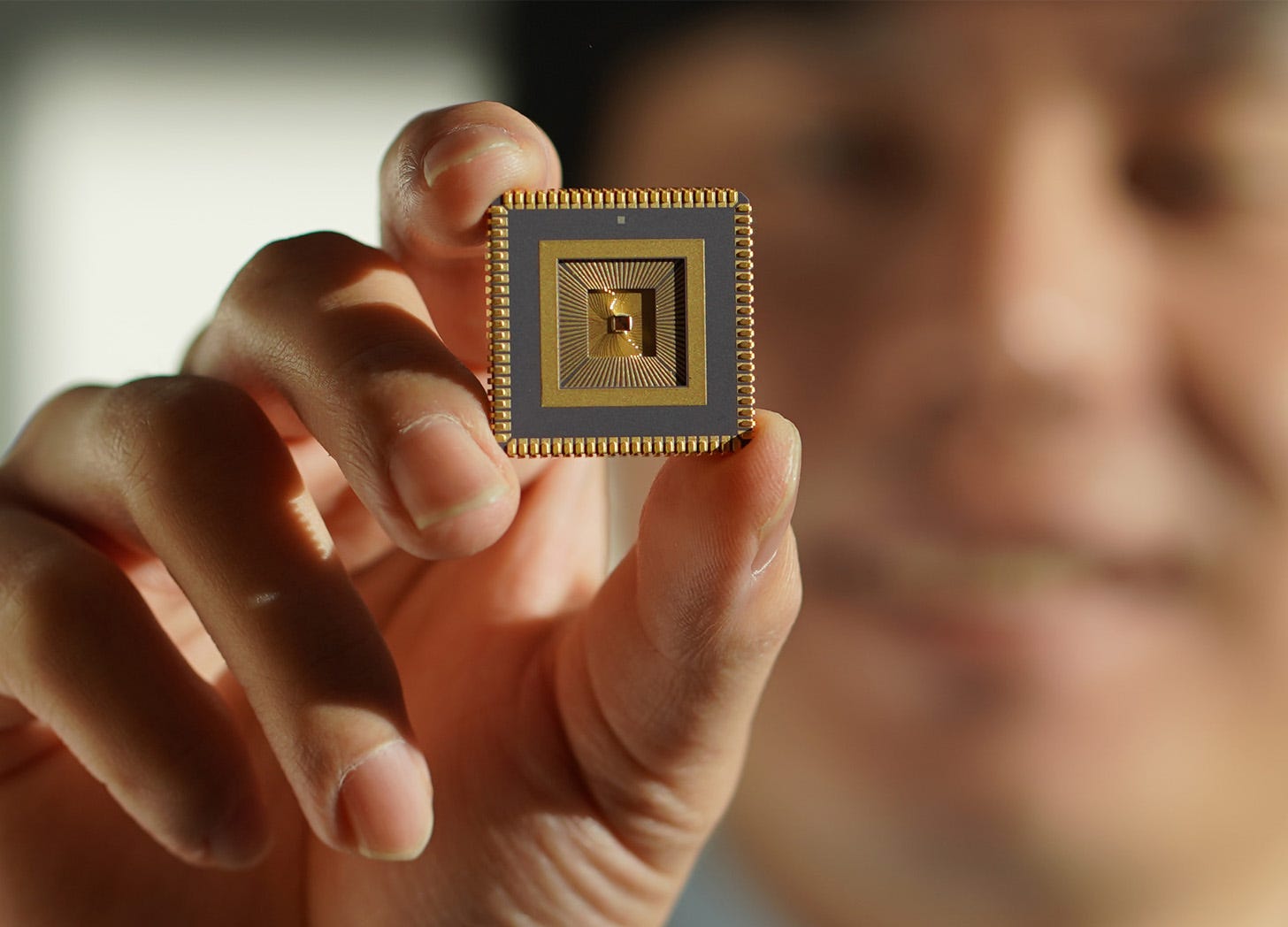
Over the space of a three-year partnership, Rigpa has developed several prototype chips, the latest of which he says demonstrates at least 28x lower power and 23x faster speeds than the customer’s existing solution.
An edge chip, it is designed to provide A.I. computing at the location of sensors themselves, rather than sending data to the cloud. A good, relatable example of A.I. on the edge is how Google’s Tensor chip in the Pixel 6 Pro smartphone transcribed my conversation with Huang on-device, in real-time as we talked. BrainChip
announced an edge computing-focused partnership last month.
A.I. is a competitive market, with plenty of big names and big money involved. But while the likes of Google and Intel have researched neuromorphic computing for years, Huang is right that the market for this type of A.I. just isn’t quite there yet. This provides an opportunity for the likes of Rigpa to develop new technology that either ends up being sought after by tech giants, or serves specific niche markets well. And of course, there’s always room for new giants to emerge as rivals to the likes of Google, Microsoft, with the right technology and the drive to market it well.
Rigpa is currently working on its commercial chip, which it plans to release in Q1 of 2023. Having been funded to date by the commercial backing for Huang’s PhD project, the startup is currently preparing its first equity round.


")